CTR & Task Time
40% faster
Time on Task
By analyzing Click-Through Rate to uncover unnecessary back-and-forth steps, we streamlined critical procurement flows. This simplification directly reduced time on task for buyers completing orders.
DATE
16/09/2024
I worked with 3 designers at Rahi/WESCO in collaboration with Google to enhance their data center solutions business platform, this being one of my successful projects is live in 40+ countries for internal clients of Google.
DATE
E-Commerce
Role
Duration
Client

E-Commerce
I worked with 3 designers at Rahi/WESCO in collaboration with Google to enhance their data center solutions business platform, this being one of my successful projects is live in 40+ countries for internal clients of Google.
Role
Duration
Client

Problem
ShopNOSCO is an e-commerce platform where data center and IT teams buy cables, power supplies, and hardware to keep their systems running. The site had become slow and confusing, making it difficult for these customers to find parts and complete purchases. The poor experience was driving complaints and hurting repeat business.

Solution
The solution replaced a fragmented, multi-page ordering process with a unified One-Step Checkout and intelligent navigation that anticipates user needs. We standardized the visual language across the platform to reduce cognitive load, allowing procurement managers to complete complex global orders 40% faster.

Impact
Task completion time dropped 40% as customers could now find and order products without friction. Page load times improved, complaints decreased, and repeat usage increased. The platform is now live in 40+ countries serving Google's internal clients for their data center needs.
Focus: Quantifying the operational and technical improvements.
CTR & Task Time
40% faster
By analyzing Click-Through Rate to uncover unnecessary back-and-forth steps, we streamlined critical procurement flows. This simplification directly reduced time on task for buyers completing orders.

ShopNOSCO is an online e-commerce store where data‑center and IT teams buy the cables, power supplies, and hardware parts that keep their systems running. Over time, the site became slow and confusing, customers started filing more complaints, and the painful ordering experience began to hurt repeat business and retention.
My Role & Responsibilities
Led a UX audit, user interviews, and current‑state journey mapping to understand how procurement, logistics, and finance actually ordered through ShopNOSCO.
Created task flows and revised information architecture, then compared current vs. future journeys to remove dead ends and reduce steps to checkout.
Turned flows into high‑fidelity Figma prototypes, ran usability tests, and refined screens based on where users still hesitated or dropped off.
ShopNOSCO before redesign
Before the redesign, ShopNOSCO already handled real orders for data‑center hardware, but the buying experience felt heavy. This walkthrough video of the old portal shows long page loads, dense tables, and several clicks just to place a single order, which often led to user confusion and dropped carts.
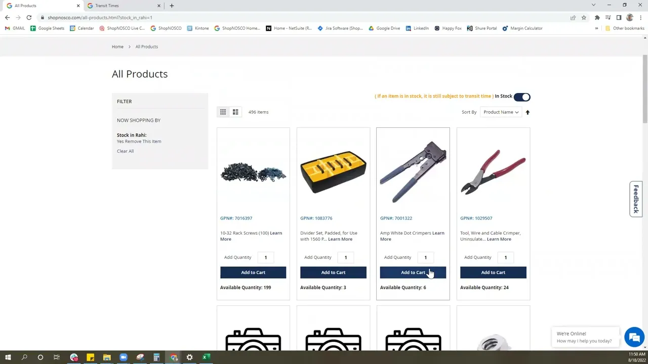
Data‑center customers rely on ShopNOSCO to quickly buy critical hardware, but the portal’s slow performance, cluttered navigation, and fragile ordering flows made it hard to find parts, trust availability, and complete purchases, driving user complaints and putting repeat business at risk.
The “Strategic Buyer” who needs efficiency and transparency.

Procurement Manager
David Chen
David manages supplier relationships for multiple data centers. He isn't just buying one item; he is buying in bulk and negotiating terms. He is under pressure to keep costs down while ensuring supplies never run out.
Diagnosing the friction
We didn't just redesign the UI, we audited the entire ecosystem. Before moving a single pixel, we conducted a "Stage 01: Empathize" phase to identify why global procurement managers were struggling. We used a mix of qualitative user feedback and quantitative technical audits to uncover the root causes of the platform's inefficiency.

Performance & Load time Analysis


The analysis revealed specific "performance issues related to loading times and page rendering
Using tools like Google Lighthouse and WebPageTest, we diagnosed "performance bottlenecks that resulted in slow page load times
The analysis highlighted gaps in the platform's reliability, emphasizing the need to "identify and fix bugs"
User Complaint Analysis
Surveys: Distributed to gather broad feedback.
Complaints: We analyzed the complaints and requests in the funnel
Interviews: Conducted to dive deeper into specific user experiences.
Usability Testing Sessions: Observed users interacting with the current system to spot friction points.
UX Audit
We performed a thorough analysis of the existing UI/UX, examining user flows, interface design, and interaction patterns.
This analysis helped us identify usability issues and design inconsistencies, providing a clear direction for redesigning the platform to enhance user experience.


Four critical failures across hierarchy, navigation, workflow, and interaction consistency.
The platform lacks a cohesive visual hierarchy, resulting in a cluttered interface that increases cognitive load for users.
The navigation structure is overly complex and does not align with user search behaviors, creating friction in product discovery.
The checkout workflow is inefficiently designed, forcing users through a lengthy and complicated multi-step process.
There are significant design inconsistencies across the platform, where interaction patterns vary unpredictably between pages.
Card Sorting
We made a lot of post its and clustered them across functionality, design and performance focused issues. This helped us understand the spectrum more widely and we geared up to brainstorm the potential solutions with Google in collaboration with the development team!
Lack of proper navigation bar
Non-clickable buttons that can be misleading
Sections are repeated
Cards have misleading information
User flow needs to improve
Non-sticky navigation bar
Lack of breadcrumbs makes it difficult to navigate
Feedback should be received in a single step
Order summary details section should display more data
No need to showcase or ask for order details if there is no order placed
Checkout process should be more intuitive
Order details in one full page in order to cross-check all the details
On selecting multiple options in category, 'category and remove this item' are displayed multiple times
Filter section is confusing
Says add quantity instead of minimum quantity
Sort options is not necessary
Cards in the best selling products lack consistency in design
Checkout process should be better designed
Lack of breadcrumbs makes it difficult to navigate
Enhance the typography for better readability
On selecting multiple options in category, 'category and remove this item' are displayed multiple times
Ensure a consistent design language across all UI elements
Improve the visual hierarchy to guide users through the interface more intuitively.
Reloads the entire page every time a filter is selected
Too many pages with similar content
Says add quantity instead of minimum quantity
Takes too much time to load any page
Cocreation & Ideation Session (Design, Development, PM & Google Stakeholders)
Below are the potential opportunities that we finalized to improve and implement
We didn't jump straight to pixels. We followed a rigorous prototyping phase to ensure every interaction was validated before final visual polishing.
We created low-fidelity wireframes to visualize the platform's information hierarchy. This allowed us to iterate rapidly on the placement of key elements like the search bar and cart summary without getting distracted by colors or typography.


While Google is stuck to their own design system we still had the leisure to tweak it a bit and here's the component based design system we finalised.

We translated our wireframes into high-fidelity designs that directly addressed the initial problems identified in research designing over a 150+ screens
We translated our wireframes into high-fidelity designs that directly addressed the initial problems identified in research.

Click in the frame once to start interacting, press 'R' to return to the homepage!
Focus: Quantifying the operational and technical improvements.
CTR & Task Time
40% faster
By analyzing Click-Through Rate to uncover unnecessary back-and-forth steps, we streamlined critical procurement flows. This simplification directly reduced time on task for buyers completing orders.
1. Systems Thinking at Scale When you are handed wireframes for 150+ screens, you can't just design them one by one. I learned to think in systems—creating scalable components and patterns that could adapt across the entire platform. Taking ownership of the majority of these high-fidelity designs taught me how to maintain consistency while moving fast to meet delivery timelines.
2. The Aesthetic of Efficiency (Function > Form) I learned that for a Warehouse Manager or a Procurement Officer, "beauty" isn't a pretty gradient—it's speed. These are people who value time above all else. I shifted my focus from making a "good-looking" UI to a "usable" UI. I realized that in Enterprise B2B, removing friction is the highest form of design.
3. Translating Data into Solutions This project taught me the true value of research data. It wasn't just about collecting numbers; it was about translating that raw data into tangible design solutions—like turning the "high drop-off rate" stat into the "One-Step Checkout" feature.
4. The Power of Micro-Interactions Prototyping was one of the most enjoyable parts of this journey. I learned that micro-interactions (like a subtle hover state or a loading animation) aren't just "delighters"—they are critical communication tools that tell the user the system is working.
5. Ownership & Collaboration While I led the visual execution and delivered the vast majority of the screens, I learned the importance of leaning on my team. My manager and teammate were crucial in unblocking me during critical crunches. Delivering this massive scope on time proved to me that I can handle complex, large-scale enterprise challenges.

ShopNOSCO was a B2B e-commerce platform that shipped to 40+ countries and managed over 900 product numbers impressive on paper, right?
But under the hood? It was dragging. Think slow load times, cluttered layouts, confusing nav, and a checkout process that felt like a mini escape room. Users were bouncing, conversions were flatlining, and the whole thing felt like it needed a UX defibrillator.
We didn’t just slap on a prettier UI and call it a day.
First, we rolled up our sleeves and got deep into the data GTMetrix audits, stakeholder interviews, support tickets, customer surveys, and enough redlined UX screenshots to wallpaper a room. We mapped the journey across five user roles, ran co-creation sessions, then tested like mad.
The result? A one-step checkout, simplified navigation, and a modular design system that actually made sense — all designed to move faster, feel cleaner, and scale smoother.

The glow-up was real.
Load speed jumped by 34%, GTMetrix gave us a gold-star 98%, and task completion times dropped by 40% (because no one wants to fight a form at 5PM).
87% of users gave us positive feedback which, for enterprise software, is basically a standing ovation.
The improved flow also brought down cart abandonment and gave the internal team a scalable system they could finally build on without duct tape and prayers.
Faster, cleaner, and finally usable the revamp didn’t just “look better,” it delivered hard results.
We saw a 34% bump in performance, 40% faster task completion, and a cart abandonment rate that actually went down for once.
GTMetrix gave us a 98% score, and 87% of users gave us the thumbs up. Internally, the design system cut dev turnaround times and helped the team scale across 150+ screens without breaking into cold sweats.
ShopNOSCO is an online e-commerce store where data‑center and IT teams buy the cables, power supplies, and hardware parts that keep their systems running. Over time, the site became slow and confusing, customers started filing more complaints, and the painful ordering experience began to hurt repeat business and retention.
My Role & Responsibilities
Led a UX audit, user interviews, and current‑state journey mapping to understand how procurement, logistics, and finance actually ordered through ShopNOSCO.
Created task flows and revised information architecture, then compared current vs. future journeys to remove dead ends and reduce steps to checkout.
Turned flows into high‑fidelity Figma prototypes, ran usability tests, and refined screens based on where users still hesitated or dropped off.
Data‑center customers rely on ShopNOSCO to quickly buy critical hardware, but the portal’s slow performance, cluttered navigation, and fragile ordering flows made it hard to find parts, trust availability, and complete purchases, driving user complaints and putting repeat business at risk.
The “Strategic Buyer” who needs efficiency and transparency.
Procurement Manager
David Chen
David manages supplier relationships for multiple data centers. He isn't just buying one item; he is buying in bulk and negotiating terms. He is under pressure to keep costs down while ensuring supplies never run out.
Diagnosing the friction
We didn't just redesign the UI, we audited the entire ecosystem. Before moving a single pixel, we conducted a "Stage 01: Empathize" phase to identify why global procurement managers were struggling. We used a mix of qualitative user feedback and quantitative technical audits to uncover the root causes of the platform's inefficiency.
Performance & Load time Analysis
The analysis revealed specific "performance issues related to loading times and page rendering
Using tools like Google Lighthouse and WebPageTest, we diagnosed "performance bottlenecks that resulted in slow page load times
The analysis highlighted gaps in the platform's reliability, emphasizing the need to "identify and fix bugs"
User Complaint Analysis
Surveys: Distributed to gather broad feedback.
Complaints: We analyzed the complaints and requests in the funnel
Interviews: Conducted to dive deeper into specific user experiences.
Usability Testing Sessions: Observed users interacting with the current system to spot friction points.
UX Audit
We performed a thorough analysis of the existing UI/UX, examining user flows, interface design, and interaction patterns.
This analysis helped us identify usability issues and design inconsistencies, providing a clear direction for redesigning the platform to enhance user experience.
Four critical failures across hierarchy, navigation, workflow, and interaction consistency.
The platform lacks a cohesive visual hierarchy, resulting in a cluttered interface that increases cognitive load for users.
The navigation structure is overly complex and does not align with user search behaviors, creating friction in product discovery.
The checkout workflow is inefficiently designed, forcing users through a lengthy and complicated multi-step process.
There are significant design inconsistencies across the platform, where interaction patterns vary unpredictably between pages.
Card Sorting
We made a lot of post its and clustered them across functionality, design and performance focused issues. This helped us understand the spectrum more widely and we geared up to brainstorm the potential solutions with Google in collaboration with the development team!
Lack of proper navigation bar
Non-clickable buttons that can be misleading
Sections are repeated
Cards have misleading information
User flow needs to improve
Non-sticky navigation bar
Lack of breadcrumbs makes it difficult to navigate
Feedback should be received in a single step
Order summary details section should display more data
No need to showcase or ask for order details if there is no order placed
Checkout process should be more intuitive
Order details in one full page in order to cross-check all the details
On selecting multiple options in category, 'category and remove this item' are displayed multiple times
Filter section is confusing
Says add quantity instead of minimum quantity
Sort options is not necessary
Cards in the best selling products lack consistency in design
Checkout process should be better designed
Lack of breadcrumbs makes it difficult to navigate
Enhance the typography for better readability
On selecting multiple options in category, 'category and remove this item' are displayed multiple times
Ensure a consistent design language across all UI elements
Improve the visual hierarchy to guide users through the interface more intuitively.
Reloads the entire page every time a filter is selected
Too many pages with similar content
Says add quantity instead of minimum quantity
Takes too much time to load any page
Cocreation & Ideation Session (Design, Development, PM & Google Stakeholders)
Below are the potential opportunities that we finalized to improve and implement
We didn't jump straight to pixels. We followed a rigorous prototyping phase to ensure every interaction was validated before final visual polishing.
We created low-fidelity wireframes to visualize the platform's information hierarchy. This allowed us to iterate rapidly on the placement of key elements like the search bar and cart summary without getting distracted by colors or typography.
While Google is stuck to their own design system we still had the leisure to tweak it a bit and here's the component based design system we finalised.
We translated our wireframes into high-fidelity designs that directly addressed the initial problems identified in research designing over a 150+ screens
We translated our wireframes into high-fidelity designs that directly addressed the initial problems identified in research.
Click in the frame once to start interacting, press 'R' to return to the homepage!
We didn't jump straight to pixels. We followed a rigorous prototyping phase to ensure every interaction was validated before final visual polishing.
Focus: Quantifying the operational and technical improvements.
CTR & Task Time
40% faster
By analyzing Click-Through Rate to uncover unnecessary back-and-forth steps, we streamlined critical procurement flows. This simplification directly reduced time on task for buyers completing orders.
1. Systems Thinking at Scale When you are handed wireframes for 150+ screens, you can't just design them one by one. I learned to think in systems—creating scalable components and patterns that could adapt across the entire platform. Taking ownership of the majority of these high-fidelity designs taught me how to maintain consistency while moving fast to meet delivery timelines.
2. The Aesthetic of Efficiency (Function > Form) I learned that for a Warehouse Manager or a Procurement Officer, "beauty" isn't a pretty gradient—it's speed. These are people who value time above all else. I shifted my focus from making a "good-looking" UI to a "usable" UI. I realized that in Enterprise B2B, removing friction is the highest form of design.
3. Translating Data into Solutions This project taught me the true value of research data. It wasn't just about collecting numbers; it was about translating that raw data into tangible design solutions—like turning the "high drop-off rate" stat into the "One-Step Checkout" feature.
4. The Power of Micro-Interactions Prototyping was one of the most enjoyable parts of this journey. I learned that micro-interactions (like a subtle hover state or a loading animation) aren't just "delighters"—they are critical communication tools that tell the user the system is working.
5. Ownership & Collaboration While I led the visual execution and delivered the vast majority of the screens, I learned the importance of leaning on my team. My manager and teammate were crucial in unblocking me during critical crunches. Delivering this massive scope on time proved to me that I can handle complex, large-scale enterprise challenges.